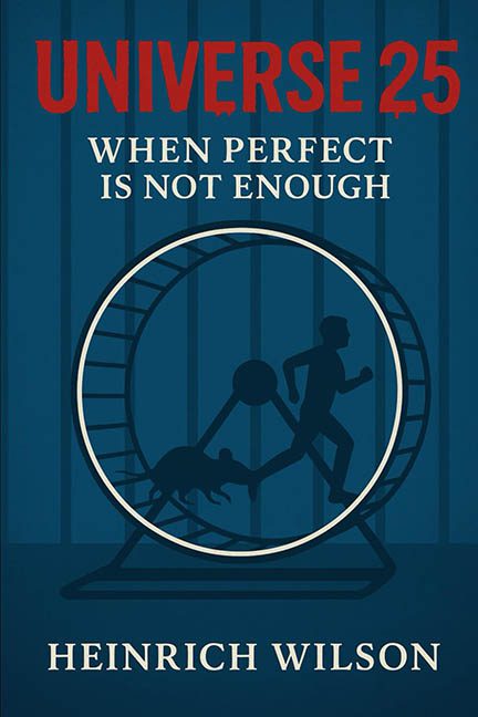
There’s dystopia, and then there’s design-topia — a bleak, joyless wasteland where graphic choices go to die. Welcome to Universe 25, a book cover that seems less “psychological sci-fi” and more “PowerPoint presentation for 10th grade sociology.”
At first glance, we’re hit with a color scheme so monotone, even the rats are depressed. Shades of prison-cell blue wrap the entire design in a cold, joy-sucking fog. It’s like someone tried to design the feeling of a Tuesday afternoon existential crisis. If the goal was to make everything feel sterile and hopeless, congratulations: the ambiance is giving DMV line, not dark philosophical thriller.
Now let’s address the rat in the room — literally. The centerpiece of this horror show is a giant hamster wheel, because subtlety is for cowards. A rat and a human, running side by side in synchronized despair, is the kind of visual metaphor that’s meant to be deep but ends up as a blunt object. It’s the graphic design version of shouting your own subtext through a megaphone. “Look! A rat! A person! The same! SOCIETY!” Okay, calm down, freshman philosophy class.
But the execution? It’s flatter than a pancake under a steamroller. The silhouettes are so devoid of life, it’s hard to tell if the human is running, speed-walking, or just gave up halfway and is coasting on existential inertia. The rat’s pose is pure confusion — part leap, part squat, part “is this a glitch in the matrix?” The proportions are wonky, and the lack of motion lines or background depth gives it all the energy of a tax form.
Now, pivot your eyes upward — UNIVERSE 25 blasts across the top in bold, screaming red, a color that says “urgent thriller,” clashing beautifully (read: horribly) with the somber background and sleepy composition. This font looks like it was picked from the “Yell Sans” family — aggressive without purpose, loud without style. It’s like a siren went off in a monastery.
Then there’s the subtitle: When Perfect Is Not Enough. Great, but which perfection are we referring to? Because it certainly isn’t the design. The font choice for the subtitle and author’s name is painfully generic — a serif style that brings absolutely no personality to the table. It’s the equivalent of ordering “plain toast” at a gourmet café. It adds nothing, challenges nothing, and clearly wasn’t invited to the same genre party as that loud title above.
The overall layout is sterile and weirdly centered in a way that doesn’t guide the eye — it traps it. It’s like a design cul-de-sac where every visual element just loops in circles without escape. Fitting for a story about a social experiment gone wrong, perhaps — but it’s hard to tell if that was the intention or just an accidental stroke of ironic genius.
Let’s not forget the absolute absence of texture, shading, or dimensionality. Everything here is smooth and flat — but not in a minimalist, refined way. No, this is flat in the way a can of off-brand soda is flat: disappointing, flavorless, and vaguely sad. It gives big “designed entirely in a browser-based app on a lunch break” energy.
To be fair, Universe 25 has potential — in concept. The story it represents might be sharp, disturbing, and deeply thoughtful. But this cover? It’s the artistic equivalent of turning in your final thesis printed on napkins. What could’ve been a haunting, eerie exploration of utopia-gone-wrong instead looks like a motivational poster from a corporate training seminar on burnout.
In the end, this isn’t just a bad cover — it’s an aesthetic cautionary tale. A visual hamster wheel of heavy-handed metaphors, lifeless design, and font choices that betray their own content. If perfect is not enough, this cover has clearly decided to aim for “almost okay” and still missed the mark.
Back to the cage with this one — and maybe let a designer with opposable thumbs take the next lap.
