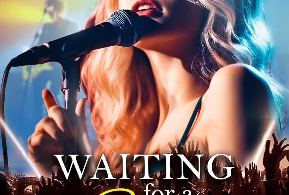

Every once in a while, a book cover comes along that looks less like a publishing effort and more like a promotional flyer for your cousin’s ill-fated garage band. Waiting for a Star is that cover — the visual equivalent of a karaoke night gone so wrong that the crowd demands refunds.
Let’s start with our leading lady. She’s front and center, clutching a microphone like it’s the last breadstick at Olive Garden. But the AI rendering has other plans: her fingers don’t quite understand how hands work, her face has that uncanny, glossy “Instagram filter meets Madame Tussauds” quality, and her expression suggests she’s not singing so much as sleeping with her eyes open. Nothing says “love triangle” like the dead-eyed stare of an AI pop idol.
And then there’s the typography. The word Star gets to shine in yellow script like it’s auditioning for the opening credits of a 1990s rom-com. Meanwhile, the rest of the text looks like it was formatted by someone who just discovered Times New Roman wasn’t the only font on Earth. It’s messy, it’s generic, and it feels like three interns each picked their favorite style and fought it out in Microsoft Word. Spoiler: everyone lost.
Oh, but the crowd. Those poor, shadowy cut-and-paste figures at the bottom — they’re supposed to be cheering, but they look like stock silhouettes lifted from a “concert flyer” clipart pack circa 2003. Their lighting doesn’t match, their energy doesn’t match, and frankly, I wouldn’t trust these people to clap on beat.
The end result? A cover that’s less Waiting for a Star and more Waiting for Photoshop to crash. If you squint hard enough, you can almost hear the faint hum of an AI generator coughing up sparkles and stage lights.
This isn’t a scandalous love triangle. This is a love triangle between AI, bad fonts, and an audience that never showed up.