Piccadilly Publishing—the house that “authors-turned-publishers” built, and the covers that make Canva templates weep. Every time they drop a new release, it’s less of a marketing campaign and more of a public service announcement for why professional designers exist.
The Art (or Lack Thereof)
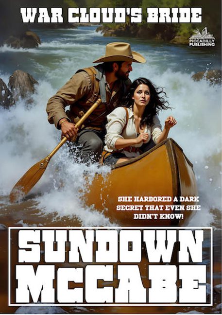
We’ve got a rugged cowboy in mid-paddle, looking like he’s auditioning for a Marlboro ad that got lost in the whitewater. Beside him, the heroine sits with all the conviction of someone waiting for a refill on her iced tea. The scene should scream danger and passion, but instead it whispers, “This was traced from a stock photo of an L.L. Bean canoe catalog.”
The Tagline Disaster
“She harbored a dark secret that even she didn’t know!”
If she doesn’t know it, it’s not her secret—it’s just bad writing. And why is this revelation floating over the rapids in giant red letters like a drowning warning sign? It doesn’t intrigue; it confuses and then makes you laugh.
The Typography Trainwreck
Piccadilly’s design philosophy is simple: Bigger fonts = better book. The title at the top, War Cloud’s Bride, is smothered in military stencil letters, while SUNDOWN MCCABE at the bottom looks like a rejected rodeo flyer. Between them, the actual artwork suffocates like a goldfish in a cowboy hat.
Publisher Fingerprints
And there it is, the little Piccadilly Publishing logo tucked into the corner. A watermark of mediocrity. A proud stamp that says: “Yes, this was made by us, and no, we don’t see the problem.”
Final Verdict
Instead of an epic western romance, we get a canoe ride through the uncanny valley, punctuated with fonts that should be tried in The Hague. Once again, Piccadilly proves that being a publisher doesn’t mean you know how to publish—it just means you’ve found new and creative ways to unleash clipart chaos upon the world.
