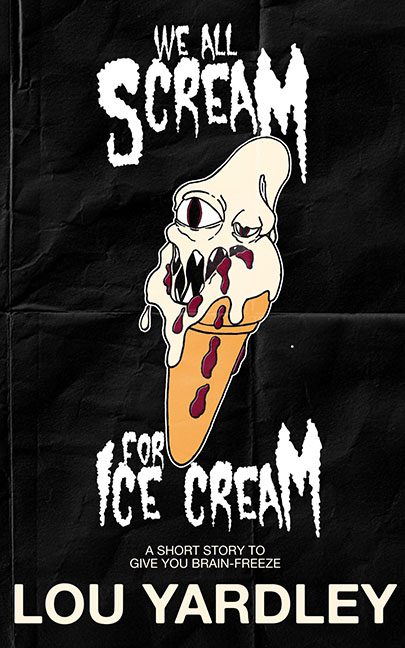
This one almost ghosted past us. At first glance, it looked like harmless camp — a punk‑zine horror vibe with a screaming cone monster and a playful grindhouse title. For a split second, we thought, “Okay, quirky. Maybe even intentional.”
But then we took a closer look.
And once you see what’s actually happening on this cover, you realize this wasn’t trying to be clever — it was trying to sneak out the back door without being roasted. Not today, cone fiend. Not today.
Let’s start with the background. That’s not gritty horror texture, that’s Photoshop Pattern #5 stamped and repeated like someone said, “Yeah, that’s enough design.” The fake fold marks are supposed to give “grindhouse authenticity,” but instead give “printed on a home laser printer and then scanned at 72 dpi.” It’s not weathered. It’s just lazy texture drag‑and‑drop theater.
Now, the star of the show: the ice cream creature.
One zoom and it becomes clear: this isn’t integrated artwork — it’s a sticker. A restruck clipart-style graphic slapped on top of the background with all the finesse of a kid sticking decals on a bedroom door. No shadows. No lighting match. No texture cohesion. Just “plop.” Layer 3, center stage.
And then, the anatomy of the design crimes continues:
Cut‑and‑paste cone creature? Confirmed.
Legibility problems from the chaotic font stack? Oh yes.
Title transparency weirdness? Present.
And the kicker… the rogue white dot in the lower right.
That random dot — a lone pixel of chaos — is the visual equivalent of spinach in your teeth during a graduation photo. Proof that nobody zoomed in. Nobody double-checked the file. Quality control left the building and never returned.
Even the tagline — “A short story to give you brain-freeze” — looks like it wandered in from a default font list and sat down wherever it wanted. No placement logic. No hierarchy. Just vibes.
Together, the elements form not a cover but a pile of assets who have never met each other, thrown into a witness protection program on top of a fake paper texture.
Final Scoop:
This cover really thought it could ghost past us on charm and weirdness.
But the moment we looked closely, all we saw was:
clipart chaos, background laziness, missing polish, and a cone that screams for a redesign.
Sorry, ice cream — you’ve melted under the spotlight.
