
Ah, We Dare. A title that exudes boldness, courage, and just a hint of… PowerPoint military fantasy roleplay? Eric Thomson’s cover for the first book in the Ghost Squadron series is what happens when someone combines the swagger of a recruitment poster with the design sensibility of a Microsoft Word template from 2006.
Let’s take a stroll through the intergalactic mess.
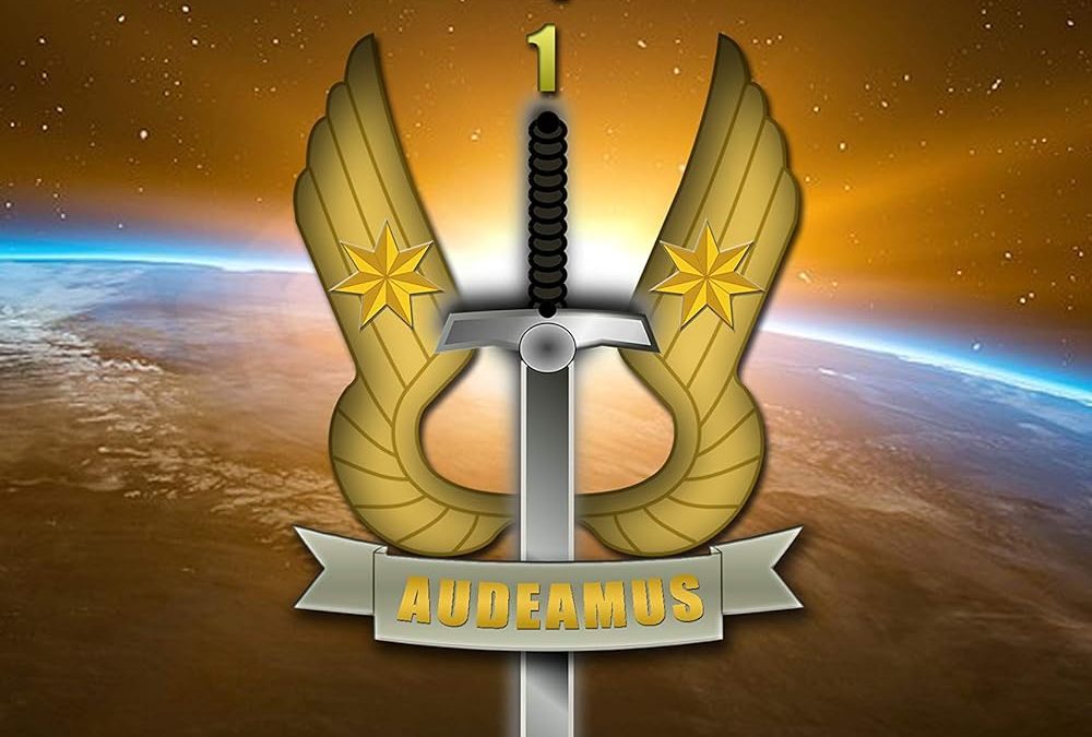
“AUDEAMUS”… and Other Latin Words We Googled
Right up front, the sword-through-wings insignia dominates the cover like it’s the seal of some prestigious, imaginary interstellar academy that offers online courses in Space Bravery 101. The addition of two gold stars? Because one just wasn’t decorative enough. And yes, the banner across the sword proudly proclaims AUDEAMUS, which roughly translates to “let us dare” or possibly “let us dare to commit graphic design crimes.”
It’s not clear whether this logo is meant to represent a military branch, a book club, or a forgotten Xbox 360 clan emblem, but it is aggressively centered, overly glossy, and painfully artificial.
A Universe of Generic
Behind the logo, we’re treated to a generic view of Earth from orbit—one that screams “stock image” like a guy in Times New Roman yelling into a void. A murky golden nebula slathers the top half of the cover, as if the universe itself were bathed in a cheap Instagram sepia filter. Is this sunrise over Earth? A dramatic supernova? A lens flare incident from someone’s iPhone 4? We may never know.
And the stars… Oh, the stars. They appear to have been applied using the “Spray Paint” tool in MS Paint, offering all the galactic majesty of a novelty mousepad.
Typography from a Time Before Taste
Let’s talk about the text. The title, WE DARE, is in bold, blocky capitals shaded with a chunky yellow gradient, like it was pulled from a brochure about tactical software for municipal police. Below it, “Ghost Squadron” sits awkwardly, as though it wandered into the wrong font family reunion. The author’s name at the bottom is presented in such an offensively basic sans-serif that it nearly cancels out the rest of the cover’s chaos through sheer visual beige.
Also, the number “1” is just… there. Floating above the sword like a lost thought or a very small motivational poster.
Aesthetic or Aggravation?
If you’re going for a sci-fi cover with military vibes, there are plenty of examples that manage to convey seriousness, scale, and action. This cover does none of that. Instead, it plants its feet firmly in the uncanny valley between amateur enthusiasm and unfiltered mediocrity.
What it lacks in polish, it makes up for in bold choices made without a second opinion. Which, frankly, is its only admirable quality.
Final Thoughts
We Dare dares to believe it looks cool. It dares to be serious. It dares to center a sword in front of some Earthspace clipart and call it a day. It also dares to ignore decades of cover design evolution in favor of something that belongs on the wall of a suburban laser tag arena.
A sincere round of applause to this cover for trying. But in the end, it’s not a leap into thrilling sci-fi—it’s a quiet stumble into Horrible Book Covers history.