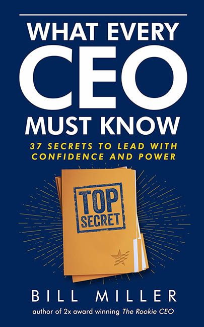
Some book covers whisper “I’m professional.” Others shout “I’m visionary.” And then there’s What Every CEO Must Know, which positively screams “I was designed during a layover on Microsoft Publisher circa 2006.” Buckle up, boardroom warriors — because this cover is about to get a hostile takeover.
Let’s start with the visual equivalent of a team-building trust fall gone wrong: the giant “CEO” in the title. Apparently, we’re meant to know this is a business book for Important People. The sheer size of the word makes it look like the rest of the title got shoved off the PowerPoint slide during a particularly aggressive quarterly meeting. “What Every” and “Must Know” are clinging on for dear life, just hoping to stay employed.
Then there’s the subtitle: “37 Secrets to Lead with Confidence and Power.” Thirty-seven. Not thirty-six, not a clean thirty, but thirty-seven. Why not round it to “A Weirdly Specific Number of Secrets That Reek of Generic Advice?” The font is a standard bold sans-serif that would be right at home on a corporate mousepad. It’s neither inspiring nor commanding. It’s the typographic equivalent of a lukewarm cup of black coffee from the office break room.
And we haven’t even discussed the “Top Secret” folder, the sad little star of the show. This isn’t a cover element — it’s a recycled clipart file that has retired from doing PTA newsletters and is now inexplicably standing in for the sum total of executive wisdom. Nothing about it screams “power” or “confidence.” It screams “please delete me.”
To really hammer in the 1990s internal HR training manual aesthetic, the folder is surrounded by a blue starburst effect, as if the designer thought, “What if this looked like the folder had divine insight?” Spoiler: It doesn’t. It looks like the folder just discovered Photoshop filters and wants a raise.
The navy background is a safe choice, and I mean that in the worst way. It’s corporate to the point of coma. Pair that with yellow text for “punch” (read: blinding contrast), and you’ve got a color scheme that evokes early web banners — and not in the nostalgic way.
The author’s name is crammed in at the bottom with all the energy of a mandatory employee compliance course. “Author of 2x award-winning The Rookie CEO” it claims, hoping the glitter will distract from the yawning design void above it.
Final Verdict:
This isn’t just a bad business book cover — it’s a buzzword-riddled visual spreadsheet of regret. If your goal was to repel anyone with an ounce of design sensibility, congratulations. Mission: Top Secret Accomplished.
