What the Cowboy Wants (Apparently Not a Realistic Cover)
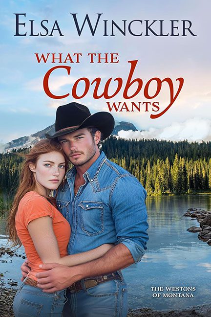
There’s nothing inherently wrong with a cowboy romance. In fact, it’s one of the most reliable tropes in the romance genre. But What the Cowboy Wants delivers a cover so squeaky clean it looks less like “Montana ranch passion” and more like “department store denim commercial.”
First, let’s talk about the cowboy himself. His shirt is so pristinely pressed, so impossibly unwrinkled, it seems this man spends more time with an iron than a lasso. If he’s working cattle in that outfit, then I’ll eat my hat — because that outfit hasn’t seen a speck of dust, let alone a whiff of manure. And the stare? It’s less “smoldering Western hero” and more “when will this photoshoot end, my jeans are too tight.”
Now, onto his lady. She’s being held in his arms like she’s supposed to be swept away, but her face tells a different story — one of mild annoyance, boredom, or possibly regret for ever signing the modeling contract. She looks like she’s about to break free of his arms and demand to know who Photoshopped her so close to the lake’s edge.
And speaking of that lake — ah yes, the generic, too-perfect wilderness background. It’s clearly been yanked from a Montana postcard, with the couple pasted in front like cardboard cutouts. The lighting on the models doesn’t match the scenery, which leaves them looking like tourists awkwardly standing in front of a green screen.
The typography is standard-issue romance font soup, and the word Cowboy gets such bold emphasis it’s almost shouting: “LOOK, THIS IS A COWBOY BOOK.” Subtlety? Never heard of it.
So, what does the cowboy want? Apparently, better graphic design.
