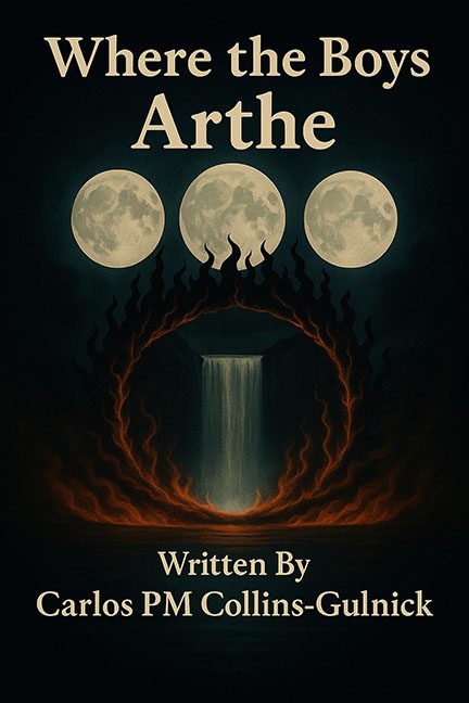
Some covers whisper mystery, some hint at grandeur, and some… well, some look like someone accidentally set a donut on fire in Photoshop. Where the Boys Arthe falls squarely into that last category.
The first crime is right at the top: three moons. Not three phases of the moon, not three variations, not even an attempt at artistic symbolism. Just three copy-pasted, identical circles slapped onto the cover like clipart stickers from a fourth-grader’s science project. Moons are supposed to stir the soul. Here, they stir the suspicion that the designer got bored after five minutes.
Then there’s the Flaming Donut of Destiny. A fiery ring encircles a waterfall, which could have been atmospheric… if it didn’t look exactly like a breakfast pastry Satan left in the toaster too long. Once you’ve seen “demonic Krispy Kreme,” you cannot unsee it. Instead of mysticism, we get pastry-based pyromania.
And finally, the typography — oh, the typography. “Where the Boys Arthe.” Not Where the Boys Are. Not Where the Boys Gather. No, here the tragic line break has stranded poor “Arthe” like an afterthought appendix at the bottom of the title. The font itself is a plain, unstyled serif that looks like it was borrowed from a Word doc template. It drags the already-awkward layout down into self-published high school poetry chapbook territory.
The result is a cover that desperately wants to be mysterious and evocative, but instead comes off as muddy, repetitive, and hilariously edible.
Verdict: A flaming donut, three cloned moons, and a title layout disaster — this cover isn’t mystical, it’s just half-baked.
