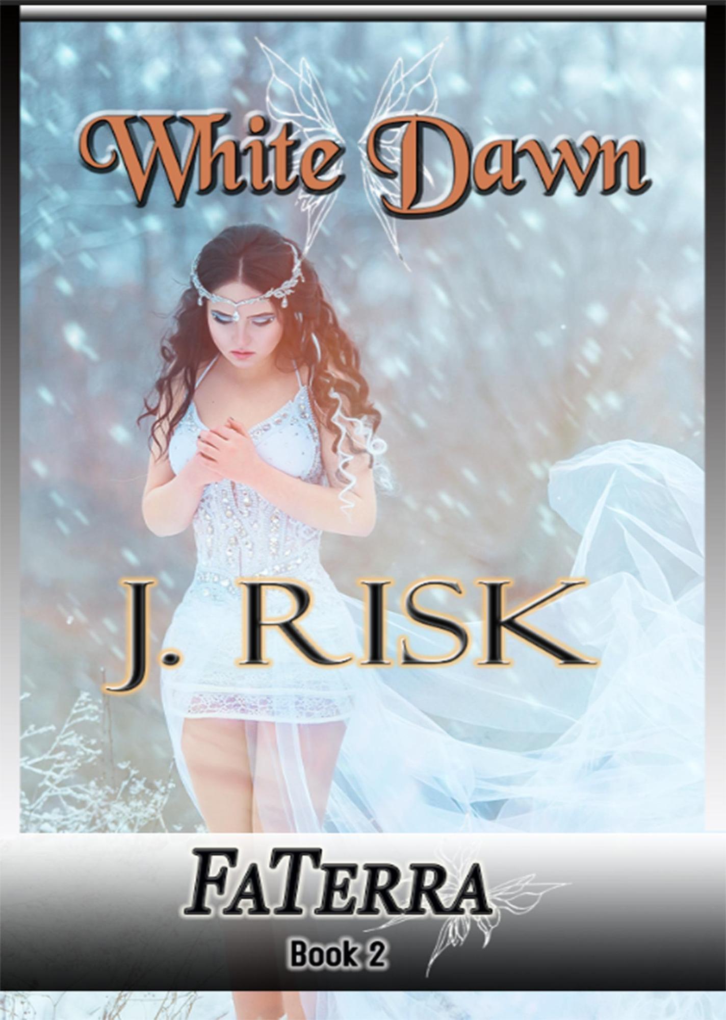
Ah, White Dawn. Or as I like to call it, “Fifty Shades of Frozen Disappointment.” Here we have a cover that’s clearly aiming for “ethereal fantasy beauty” but ends up landing somewhere between “bridal boutique window mannequin” and “first-year photography student discovers snow filter.”
Front and center, we have our protagonist: a solemn woman who appears to be deep in thought — possibly about why she agreed to model for this shoot when the payment was clearly just exposure. She’s adorned in a glittery corset dress so short it makes Elsa look overdressed, and draped in what I can only assume is leftover tulle from last year’s prom decorations.
Then there are the fairy wings. Oh, the fairy wings. They’re so faint you might miss them entirely unless you squint — which makes me wonder if they’re not wings at all but the spectral remains of the designer’s motivation. It’s like the cover is trying to whisper, “There’s magic here, probably,” without committing to the bit.
The typography is a case study in graphic design crimes. The title White Dawn is rendered in orange, because…? Nothing says “icy winter wonderland” quite like the warm hue of a pumpkin spice latte. The author’s name sits below it, crisp in a different font, as if to say, “I didn’t make the title choice, please don’t blame me.”
And finally, the pièce de résistance: the FaTerra Book 2 banner. This chunky silver-and-black slab looks like it was stolen from the opening credits of a low-budget medieval PC game circa 2004. It slices across the bottom of the cover like a sword through narrative cohesion, utterly at odds with the rest of the imagery.
The overall vibe? Like someone rolled “snow,” “fantasy,” and “awkward typography” on a slot machine and just hit “Publish” without looking back.

