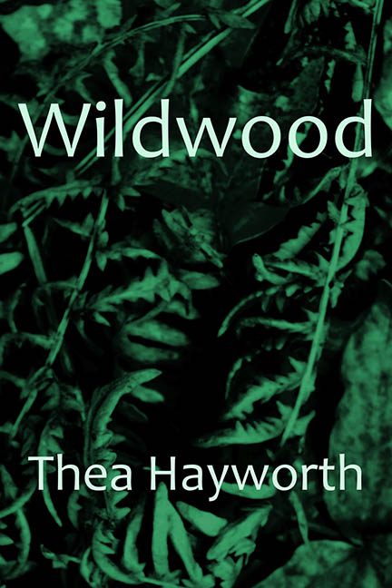
If you’ve ever wandered through a dollar store and stumbled across a stack of notebooks labeled “Dream Journal” with a blurry forest on the front, congratulations — you’ve already experienced the visual essence of Wildwood.
Let’s start with the image. Or rather, the offense against clarity and contrast. This isn’t a forest. This is a cryptic tangle of ferns, filtered through what appears to be leftover night vision footage from a 1997 Discovery Channel special. It’s dark. It’s green. It’s leafy. That’s it. That’s the entire vibe. It screams, “I’m deep, mysterious, and printed exclusively at home on a recycled inkjet.”
The typography is so generic, I half-expected the title to read “Insert Title Here.” We’re talking unformatted, unstyled sans serif — Helvetica or Arial in white, because why not go full Microsoft Word default? There’s no hierarchy, no layout logic, and no effort to make it blend or pop. The text simply floats, like it’s desperately trying to escape the foliage behind it.
This cover is a masterclass in doing the absolute minimum and then doing slightly less.
Where is the mood? Where is the story? Where is even one indication of genre? This could be a YA fantasy, an environmental manifesto, or an experimental poetry chapbook written entirely in moss. The only mystery this cover evokes is, “Why was this approved?”
Let’s also talk color. That shade of green? It doesn’t whisper “enchanted forest” or “dangerous wilderness.” It shrieks “military camouflage filter accident.” It dulls the image until the leaves become indistinguishable shapes in a forest of visual apathy.
There’s no logo. No tagline. No texture. No soul. Just a flat, over-filtered image of ferns, like the cover designer wandered into a botanical garden, passed out, and woke up to find their laptop had auto-published a book on its own.
To its credit, Wildwood does one thing well: it makes you appreciate the power of actual design. Because this cover? This is not design. This is what happens when Photoshop gets ghosted by taste, contrast, and artistic direction all at once.
Nature deserves better. So do readers. So does this book.
