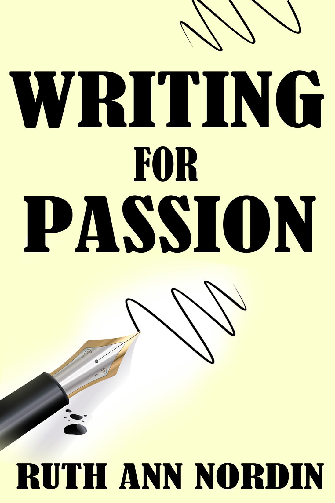
There are covers that underwhelm, and then there’s Writing for Passion, which manages to take the word “passion” and strip it of every ounce of energy, color, and life. This is less “writing on fire” and more “writing in line at the DMV.”
Let’s start with the color palette. Passion, by definition, calls for bold reds, rich purples, or at least something with energy. Instead, we’re given a pale beige-yellow wash that looks exactly like the walls of a waiting room where you fill out insurance forms. It doesn’t inspire passion. It inspires a nap.
Now the typography. Oh, the typography. The words WRITING FOR PASSION are bellowed in a generic block serif font so heavy it could crush the pen beneath it. This is the kind of typeface you’d expect on a football flyer (“HOMECOMING GAME FRIDAY”), not on a book cover supposedly about art, creativity, and fervor. It’s not romantic. It’s not exciting. It’s just shouting because it doesn’t know what else to do.
And then, of course, there’s the pen. Our one and only graphic element. A lonely fountain pen clipart image, scrawling a random squiggle across the void. This squiggle is supposed to represent creativity, I think, but it looks more like the pen slipped out of someone’s hand mid-sneeze. To add insult to injury, there’s a little ink blot next to the nib—because nothing says “passion” like an accidental stain.
The composition overall is tragic. Big heavy text squats at the top and bottom, leaving a vast middle desert of beige nothingness. Minimalist covers can be striking, but this isn’t minimalism—it’s giving up halfway through the design process.
The result? A book called Writing for Passion that looks like it was designed with none. It’s the equivalent of buying a Valentine’s Day card, crossing out the heart, and replacing it with a sticky note that says “whatever.”

