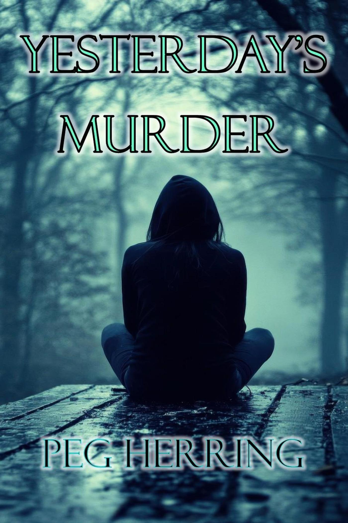
Ah yes, Yesterday’s Murder, the perfect title for a book whose cover looks like it was designed by someone who just discovered free trial stock photo downloads and thought, “Yeah, this one screams homicide.”
We open with the classic “sad person facing away from the camera” shot — because nothing says “edge-of-your-seat murder mystery” quite like a hoodie-clad figure sulking on what appears to be a wet picnic table in a state park. I’m sure there’s a corpse somewhere… probably under the table… but the cover designer decided mystery is best conveyed through emotional dampness.
The forest in the background? Pure, high-res melancholy. You can practically hear the lo-fi rain playlist and smell the “Rain on Cedarwood” Yankee Candle burning in the background. The sky is muted, the trees are skeletal, and the whole scene is tinted in a trendy “depression teal” filter that’s become the official Pantone of every true-crime paperback that forgot to hire an illustrator.
And then… the font. Oh, the font. It’s serifed, it’s centered, and it’s sporting a faint glowing aura like it just unlocked a +2 Sword of Brooding in an RPG. Whoever chose this effect clearly believed that a subtle neon outline would say “gritty murder,” but unfortunately it says “mall escape room poster.”
As for the title placement — it’s technically centered, but the overall vibe is less “carefully balanced composition” and more “WordArt in 2007 PowerPoint.”
By the time you add the author’s name at the bottom, the entire layout starts to feel like the intro card for a YouTube true-crime channel hosted by someone who only films at night in their garage.
If murder is what’s being sold here, it’s the murder of design principles.

