Sep 18, 2025 | Horrible Covers
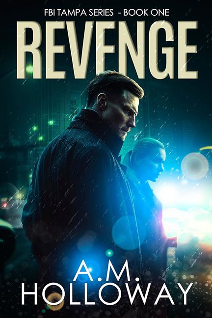
See this cover on Good Reads Some covers whisper subtle intrigue. Others scream “discount Netflix original.” Revenge plants itself firmly in the latter category, trying to pass off neon rain and moody trench coats as “atmospheric” when really, it’s just the...
Sep 17, 2025 | Horrible Covers
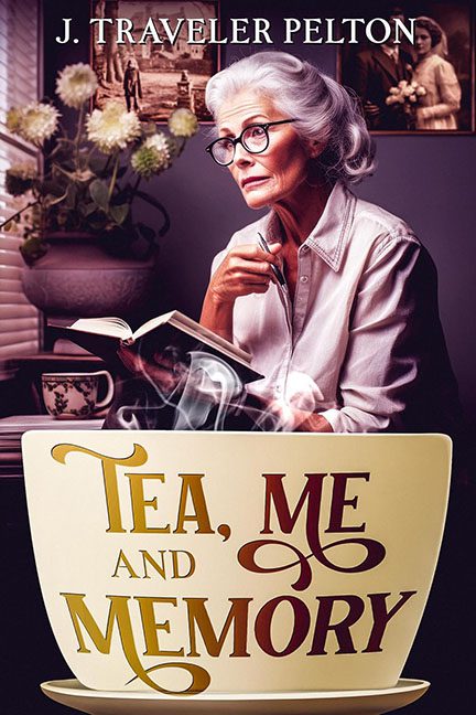
See this cover on Good Reads Covers are supposed to give you a sense of the story. Tea, Me and Memory gives you a sense that your grandmother is silently judging you for not calling more often. Let’s start with our leading lady: perched at a table, book in hand,...
Sep 17, 2025 | Horrible Covers
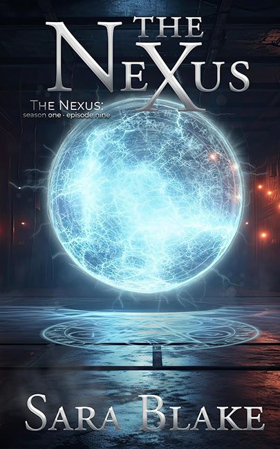
See this cover on Good Reads Some covers don’t even need to be roasted — they roast themselves just by existing. The Nexus is one of those. This design hinges entirely on a single glowing orb, and unfortunately, that orb looks less like a mysterious interdimensional...
Sep 17, 2025 | Horrible Covers
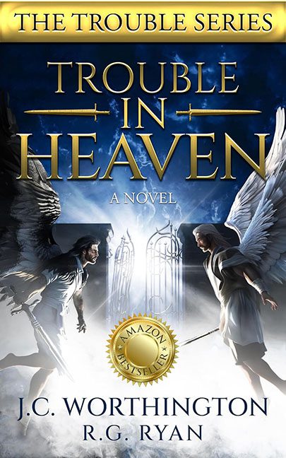
See this cover on Good Reads Sometimes a cover is bad in a boring way, and sometimes it ascends into a special kind of chaos that can only be described as “graphic design purgatory.” Trouble in Heaven lands squarely in the latter camp, looking less like a celestial...
Sep 17, 2025 | Horrible Covers
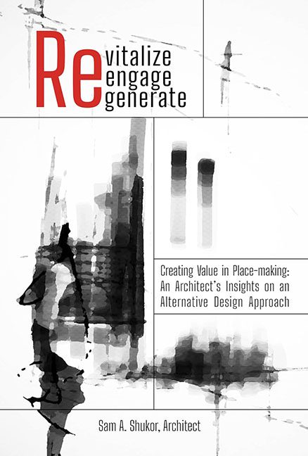
See this cover on Good Reads Some covers look like books. Others look like corporate brochures left behind at a conference table. Revitalize, Engage, Generate lands firmly in the latter camp — a visual reminder that buzzwords can’t build bridges, and bad design can’t...