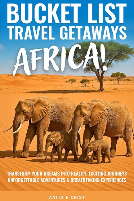
Sep 9, 2025 | Horrible Covers
See this cover on Good Reads Welcome to Bucket List Travel Getaways Africa!, where every word is a headline, every font is screaming, and subtlety got left behind somewhere in the Sahara. This cover isn’t just a design—it’s a visually overloaded safari emergency....
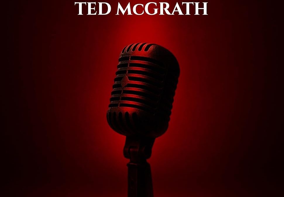
Sep 9, 2025 | Horrible Covers
See this cover on Good Reads Ah, Stage Empire — where one microphone stands alone, dramatically spotlighted like it’s about to deliver a soliloquy on how it was Photoshopped into this nightmare against its will. Let’s start with that title font, shall we? It’s...
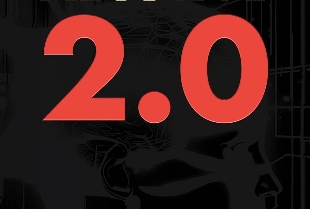
Sep 9, 2025 | Horrible Covers
Nothing screams “thought leadership” like slapping the biggest font size you can find onto a cover and calling it innovation. Xecutive 2.0 doesn’t just whisper futurism — it shouts like a malfunctioning fax machine. That gigantic “2.0” in blaring red is less “next-gen...
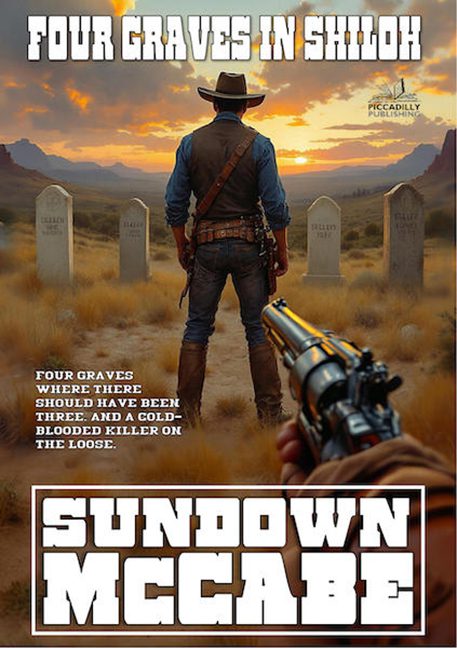
Sep 2, 2025 | Horrible Covers
See this cover on Good Reads Piccadilly Publishing is back at it again, reminding us that when authors run their own publishing company, you don’t always get creative freedom—you sometimes get graphic design held hostage by clipart and cowboy clichés. Four Graves in...
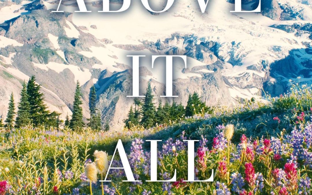
Aug 19, 2025 | Horrible Covers
See this cover on Smash Words Proof that mountains can be majestic… and still photobombed by bad typography. Ladies and gentlemen, gather ‘round for today’s installment of “Why Did This Happen to Design?” — a little number I like to call Above It All. Here’s the...